freebie, a "100%-off" feature concept for Groupon.
october-November 2017
Project Setup
In this project, I would be participating in a scrum for the first time, and I was chosen as the group's scrum master. The basis of the project was fairly simple; find a topic all four group members can get behind, pick a company best suited to solve your problem, pitch it to people acting as high-up stakeholders for that company. The project lasted 5 days.
Our initial topics were pretty awful — either too personal to one group member, or too complicated to get behind. From solving ethical dilemmas regarding artificial intelligence to helping art students recycle supplies, it was really hard for the four of us to decide on something. Ultimately, the idea with the majority backing was a resource to identify free products, services, and events in your local area.
Here was our initial problem statement:
Bargain hunters are interested in finding and sharing the knowledge of free products, services, and events. How might we design a platform where free products, services, and events are both advertised and discoverable while creating a trustworthy brand?
Additionally, we had to identify a brand that was best suited to support our design choice, and decided that Groupon was our best bet. Since we couldn’t decide on how to focus on just products, just services, or just events, we had to choose an all-inclusive brand like Groupon versus a more specific brand like EventBrite. We felt that Groupon was the most effective choice with the idea of the “100%-off” coupon.
The Research
We conducted 6 user interviews and 2 contextual inquiries during our research. What we learned from our interviews was that loving free stuff is not exclusive to bargain hunters — it doesn’t matter your financial standing, free stuff is free stuff. However, finding quality free stuff was what people really wanted, and there wasn’t a great resource out there to satisfy people’s needs. With an opportunity identified, we still found ourselves at a crossroads in solving this problem — until, we had an epiphany: that day, one of our classmates came into the classroom with a cup of coffee and said “Guys, there’s free coffee at Toby’s until noon.” As he sat down in his chair, ten other people got up and ran to Toby’s to get coffee. It was at that moment where we realized that there is an inherent joy in sharing free stuff with people you know or care about.
Combined with our prior research, we were able to reiterate our problem statement:
Users love the experience of happening upon quality free goods and events. However, searching for them makes users feel overwhelmed by irrelevant and low quality free offerings. How might we design a mobile experience that mirrors the delight of naturally finding free goods and events?
And with that in mind, we started to design “freebie”.
Designing freebie
Our design phase was supposed to be timeboxed. However, we found that it was very difficult to get on the same page. This was the first time during the process that I decided it would be okay to stray from the Scrum. Though we spent too much time designing the app, it really showed in our usability testing later. There were three main features that we all agreed needed to include, and this became our MVP:
A map, which users could use to explore their local surroundings for all reported freebies (the word freebie became our word to define free products, services, and events inclusively).
An announce feature, where users could share the freebies they find with their community.
A filters feature, which could be used to filter the various types of freebies on the map that were visible.
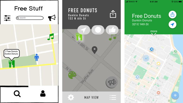
The screens above show the transition of the quick-view for a freebie. At first, we thought a clickable pop-up would be fun, but users struggled to click it again to find more about it. We decided to make it a drop down, and from there users responded saying they don’t know why they would rate or comment on a freebie if they were browsing — excellent points. So in our final iteration, we added a drop-down “more” that would show both rating and previous comments from other users who visited the freebie. The two buttons were easily understood by our users — the common share button, and the map button which would open the apple map app and get them directions from their current location to the freebie.
Usability Testing and Feedback
We conducted three rounds of usability testing, from low to mid to high fidelity, with 4 participants in each round. At each stage, we got excellent feedback which ultimately led us to a great final product. We tested two things: finding a freebie, and reporting a freebie. The only failure we had throughout all the testing was one user who couldn’t report a freebie due to unclear iconography. While we did make several changes to iconography in general, we actually decided against changing that particular icon since it perfectly captured the essence of announcing an event. Instead, we created an on-boarding process in the high-fidelity testing which users found both learnable and enjoyable.
The Prototype

Feel free to try out the prototype with the task of finding free donuts, and announcing free donuts — I’m sure you’ll find it just as easy as our users did!
Link to the Prototype (InVision)
Next Steps
We found that our app design was in a great place, ready to be shipped. However, after launch we would get back to work a few notable improvements:
Create a calendar view, so users could see upcoming freebies and plan for them.
Introduce a light profile with a username, picture, some personalized settings, so users could rate and comment on the freebies.
Release an android prototype to expand our reach.
Start thinking about revenue generation. Interestingly, our research showed that users would pay for exclusive access to free content. We would A/B test a one-time purchase from the app store, or a way for companies to feature their content on the app.
Closing Thoughts
In the end, our group really came together to create a great final product. The Scrum methodology proved very effective, as we were able to meet all of our deliverables in a timely fashion, while keeping organized on all tasks. As four first-timers, it wasn’t the easiest process to adapt — but allowing flexibility and appropriately collaborating in the Scrum really made for an efficient process.